A Clear Path Through the Digital
Digitalewege is a development studio focused on building clear, results-driven WordPress websites. The objective of this project was to create a strong, recognizable brand and website that reflect technical expertise, precision, and a no-nonsense mindset.
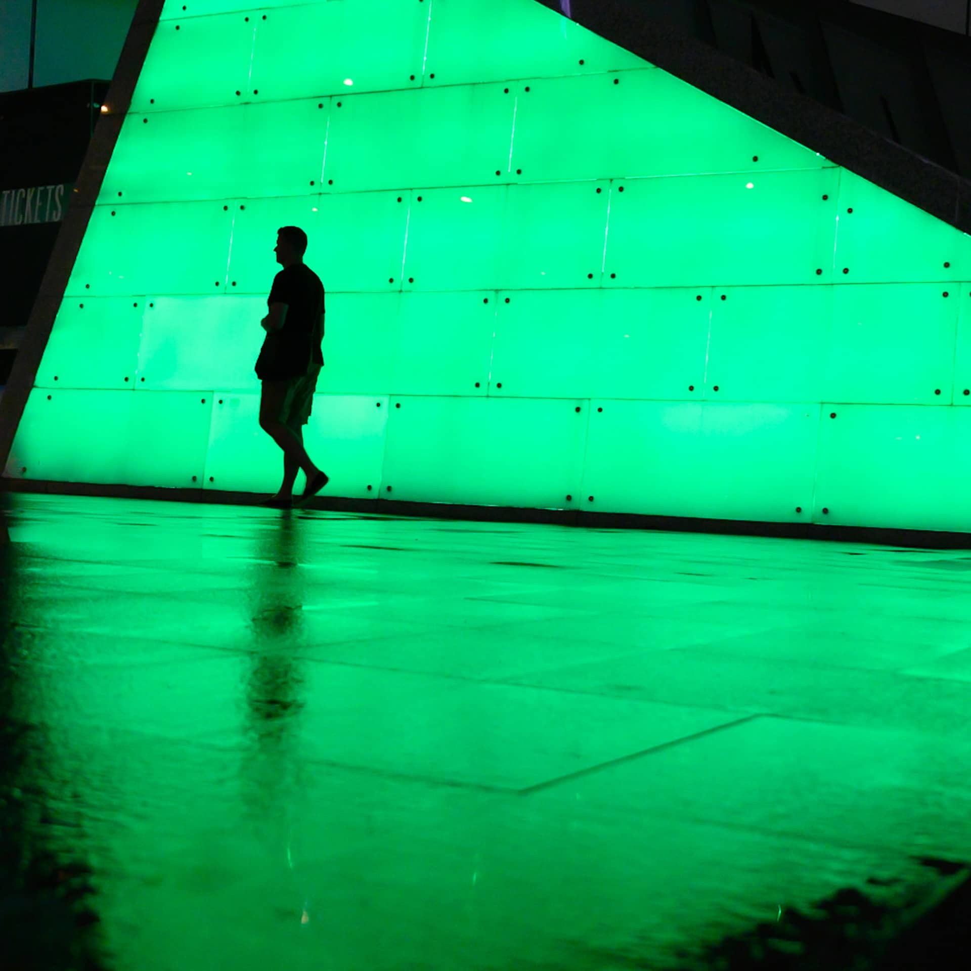
Since the brand name itself translates to “digital paths,” the central idea was to visually express guidance, direction, and structure. The design needed to feel distinctly technical and modern, while remaining minimal and focused. The result is a brand system that communicates clarity and competence at first glance, positioning digitalewege as a reliable partner for digital solutions.
Branding & Visual Identity
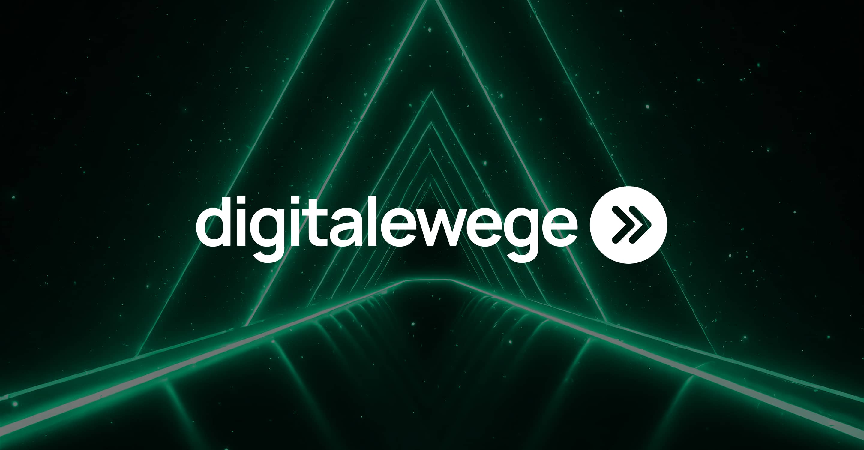
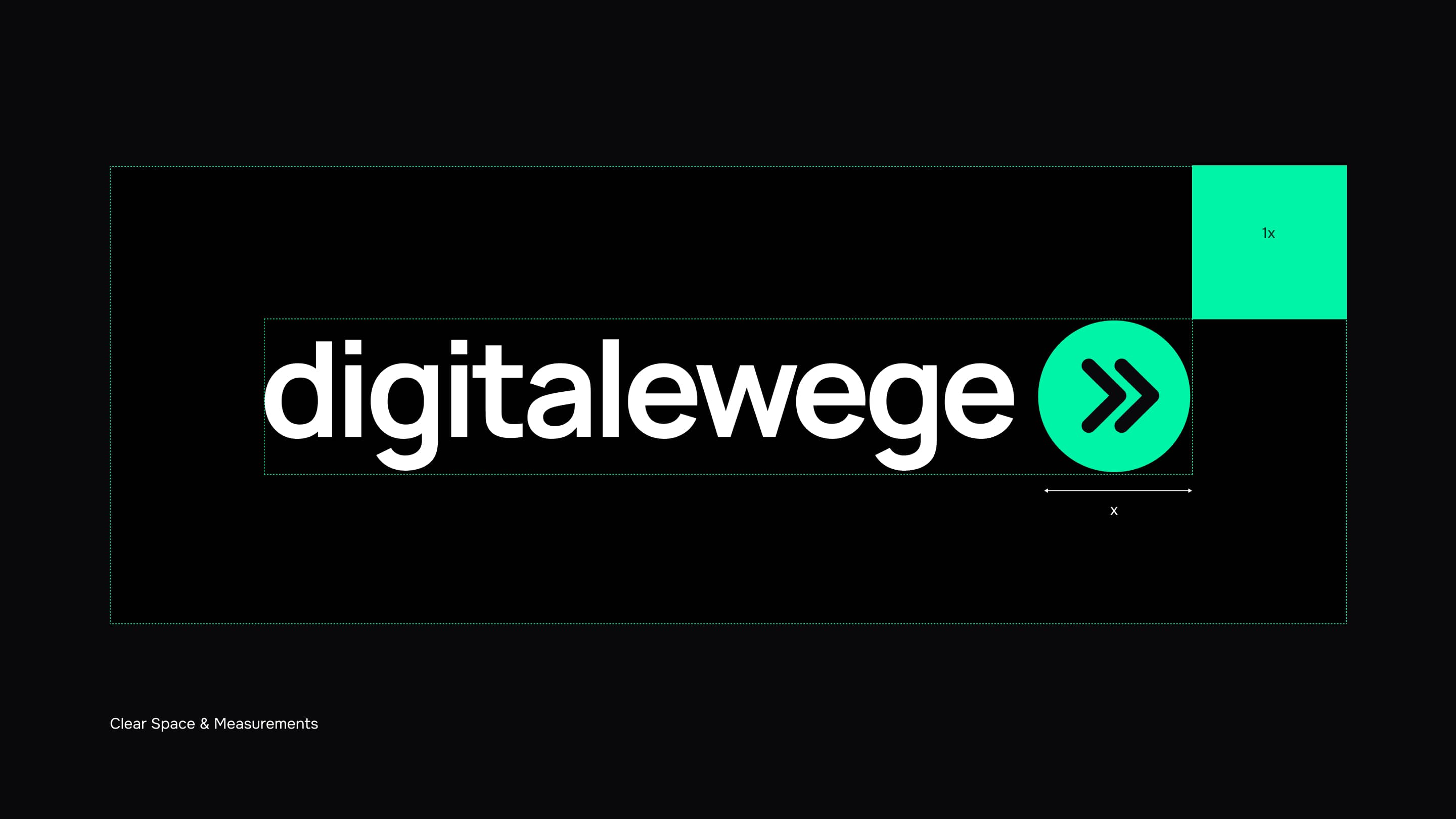
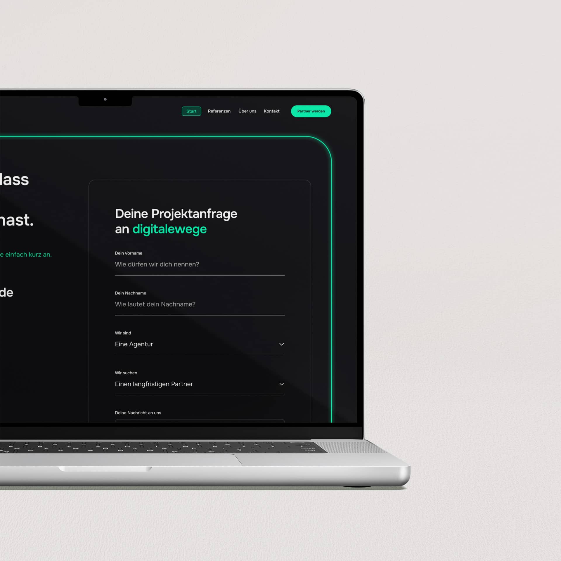
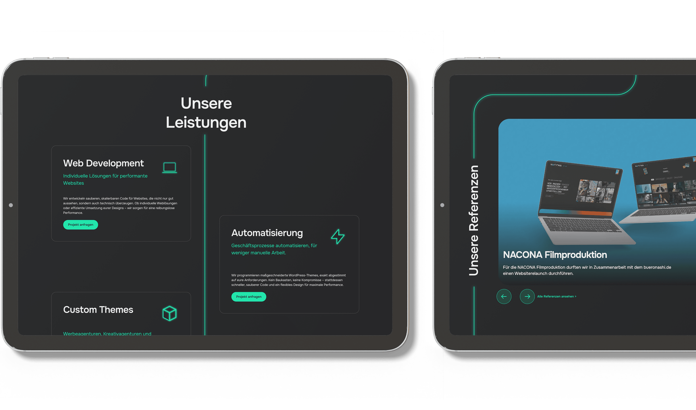
The branding for digitalewege is built around a clear visual concept - a continuous line that runs through all brand assets. This line symbolizes direction, progress, and the digital paths the studio creates for its clients. It acts as a unifying element across logo usage, layouts, and digital touchpoints.
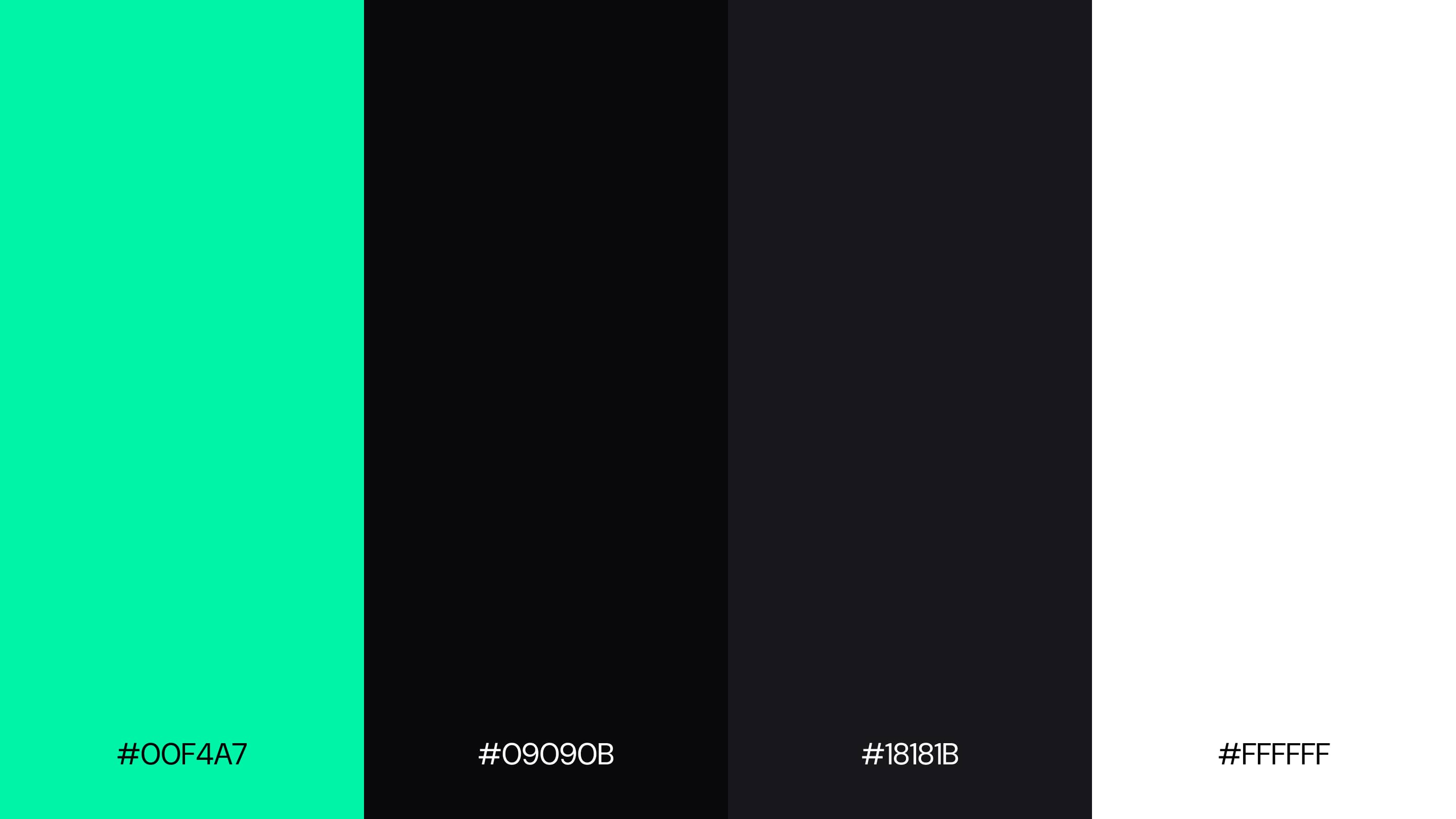
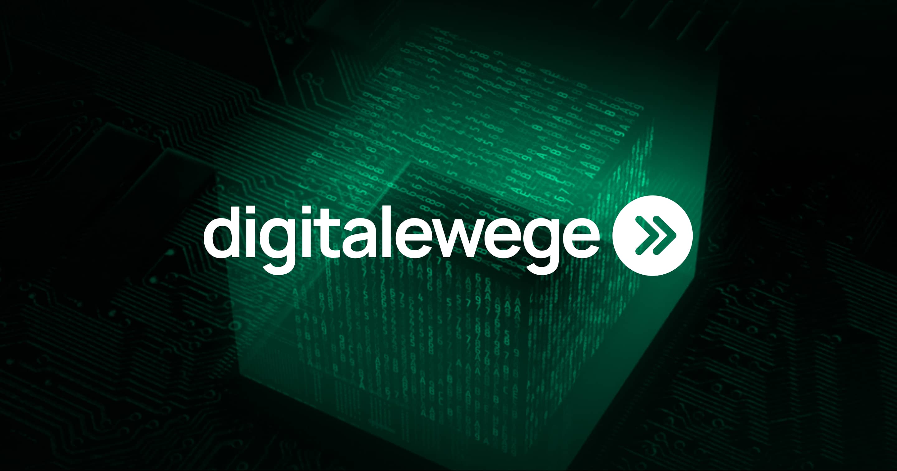
A dark base combined with neon green accents was chosen to emphasize the studio’s technical focus and developer mindset. The high-contrast color palette creates a strong visual presence while reinforcing a modern, tech-driven identity. Neon highlights are used deliberately to guide attention and create rhythm within the design, without overwhelming the interface.
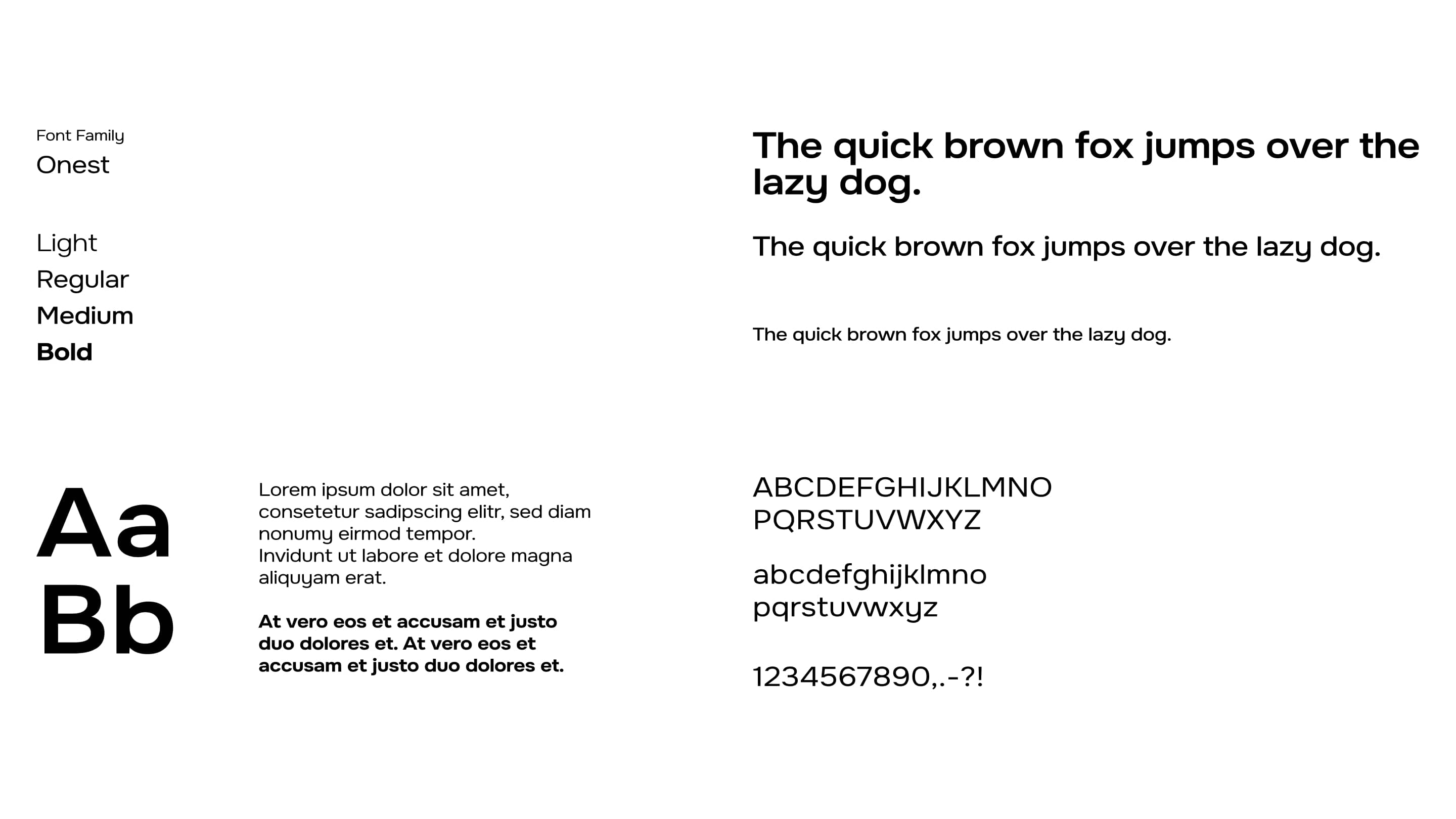
Typography is clean, modern, and highly legible, supporting clarity across both branding and UI elements. The overall identity feels sharp, confident, and purpose-driven, reflecting a studio that values structure, efficiency, and precision.
Print Design
Digital Design
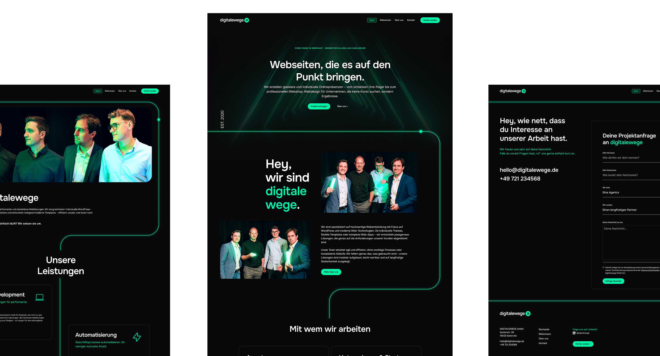
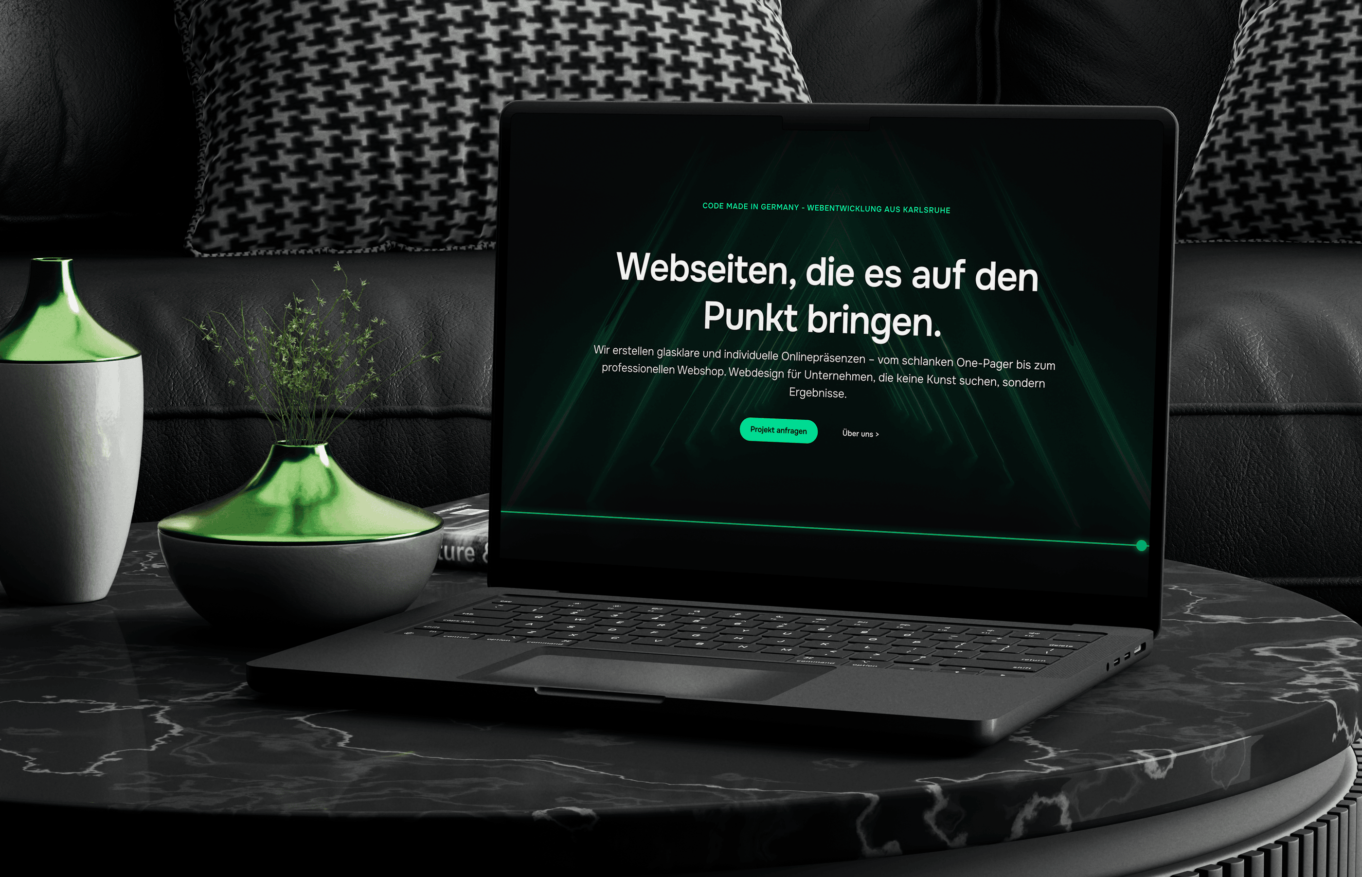
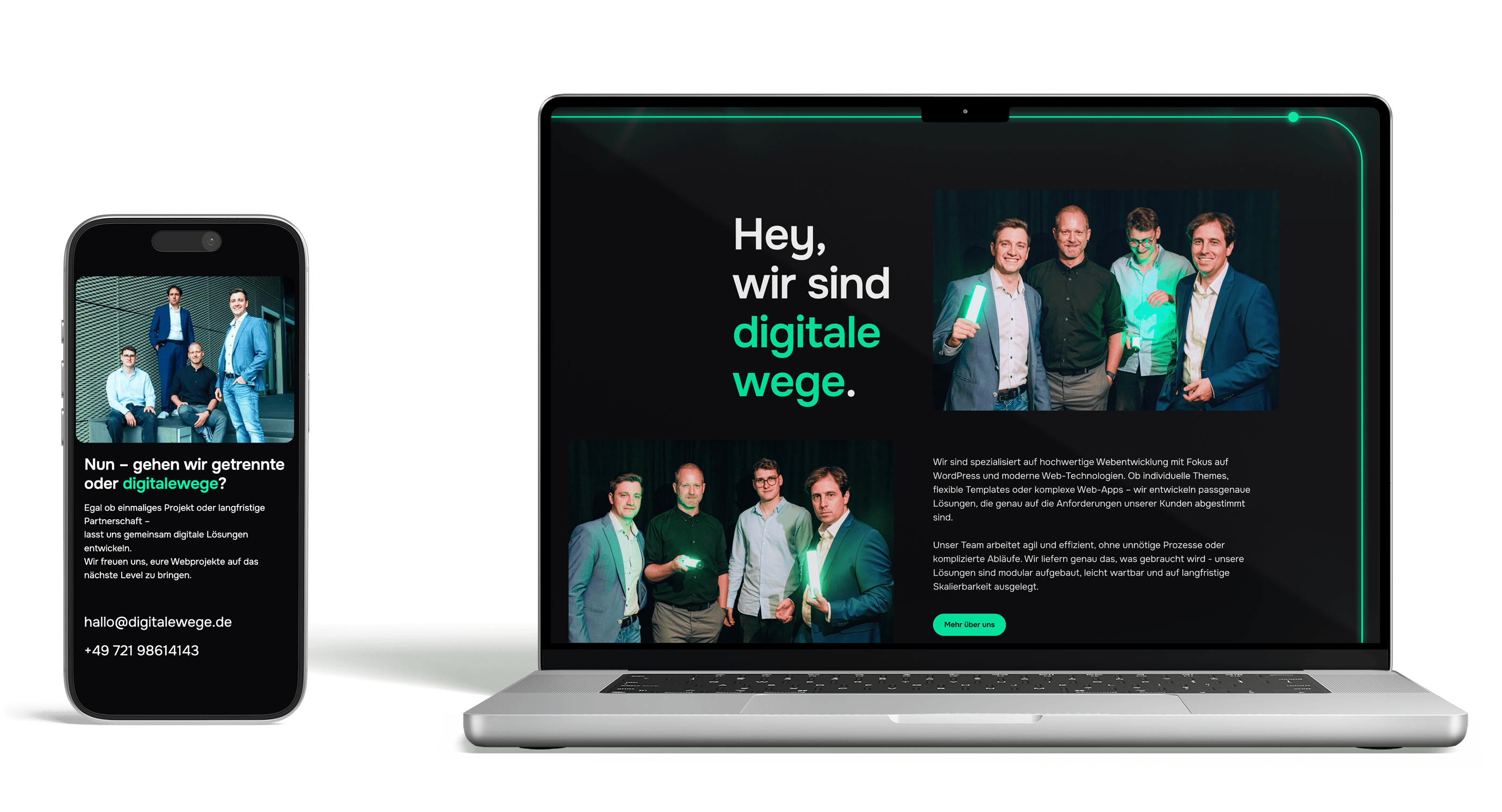
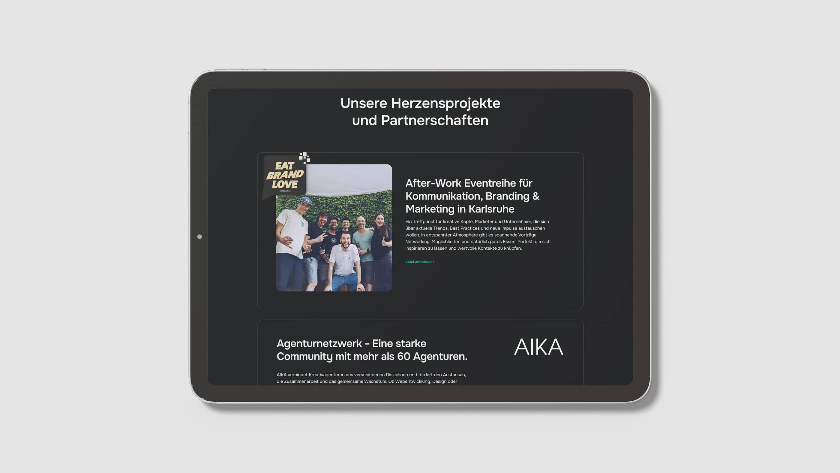
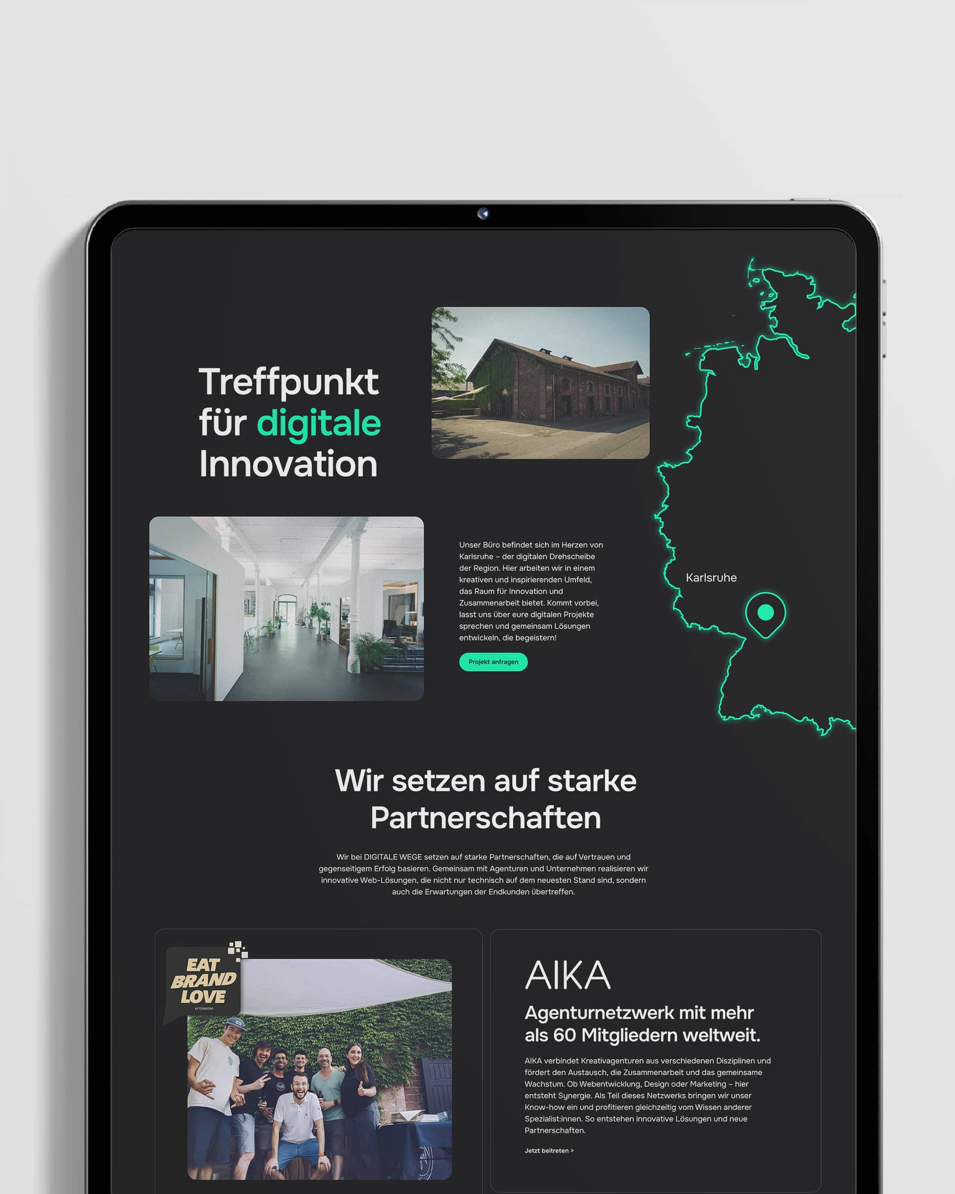
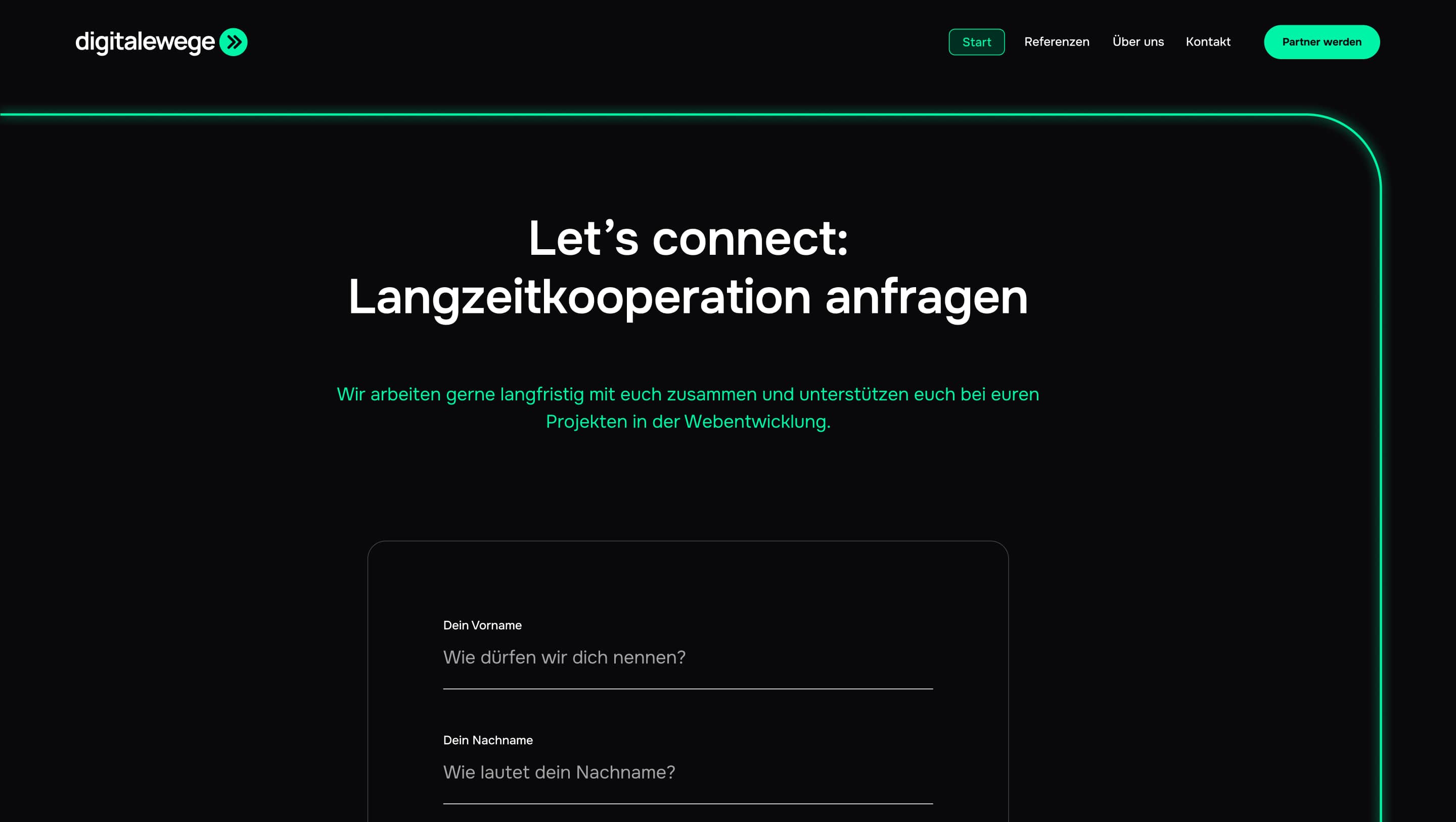
The website was designed as a clear and focused entry point into the digitalewege brand. Strong typography, high contrast, and structured layouts ensure that content is easy to scan and understand, while the recurring line motif subtly guides users through the page.
Rather than relying on decorative elements, the design emphasizes functionality and clarity. Motion, highlights, and visual accents are used sparingly to reinforce key messages and calls to action. The dark interface supports long viewing sessions, while neon elements create a distinct and memorable experience.
The result is a website that feels technical, modern, and intentional. It communicates expertise without unnecessary complexity and positions digitalewege as a development studio that delivers clear solutions and well-defined digital paths.


More Projects
View all Projects
Redesign for Liyana's Beauty Studio
View Project
Redesign for Fuhrparkhelden
View Project