Elevate your look with just a wink.

Liyana Benedict is a beauty studio based in Germany, specializing in high-quality eyelash extensions and lash lifts. The goal of this project was to build a cohesive and professional brand presence that reflects precision, care, and trust - values that are essential in the beauty industry and in personal services that rely heavily on confidence and long-term client relationships. The studio required more than just a visual refresh. The challenge was to create a brand that feels calm, modern, and premium while remaining approachable and personal. Every touchpoint needed to communicate quality, cleanliness, and attention to detail, without feeling overly decorative or trendy. The result had to appeal to clients who value professionalism and consistency, while still feeling warm and inviting.
By developing a clear visual system across branding, print, and digital media, the studio received a unified identity that works seamlessly online and offline. The new brand presence strengthens trust, improves recognition, and supports the studio’s positioning as a reliable, high-quality beauty service provider.

Branding & Visual Identity
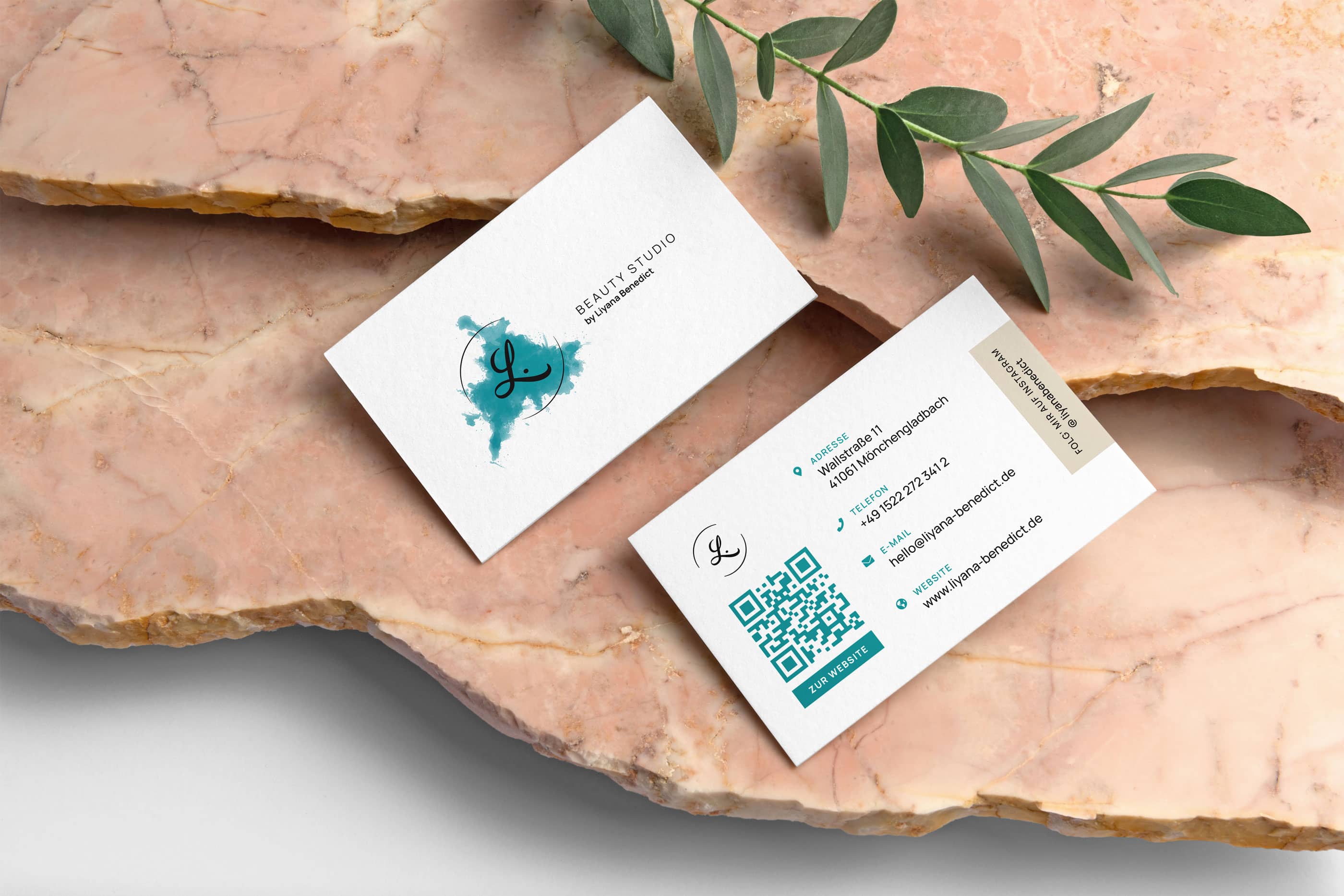
The brand identity was developed to be minimal, elegant, and timeless. At the core of the branding is a clean logo concept built around a stylized “L,” complemented by soft, abstract arcs that subtly reference eyelashes. This creates a recognizable mark that directly connects to Liyana’s services without being literal or overly decorative. A neutral color palette and refined typography were chosen to convey professionalism and premium quality, while remaining flexible for use across digital and print applications. The resulting identity feels calm, trustworthy, and sophisticated - perfectly aligned with the studio’s positioning and target audience.
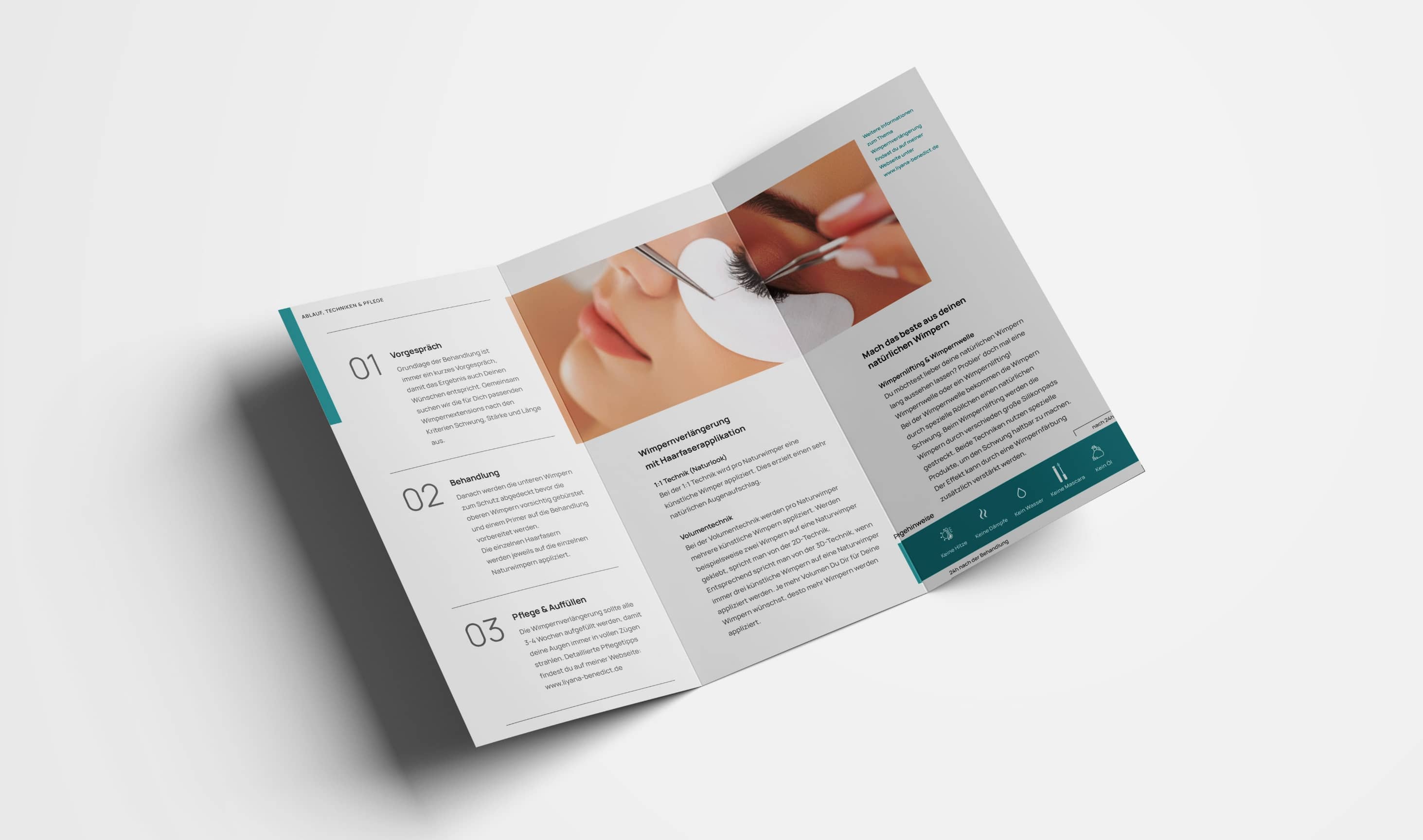
Print Design
The print materials were designed to translate the digital brand experience into the physical world with the same level of care, precision, and elegance. Every piece focuses on clarity, calm aesthetics, and a high-quality feel that reflects the studio’s services and attention to detail. From business cards and loyalty cards to care flyers and posters, the designs follow a consistent visual language built around soft color contrasts, clean typography, and intentional use of white space. Informational materials such as care instructions were structured to be easy to read and practical for clients, while still maintaining a refined and professional look. The result is a cohesive set of print assets that strengthens brand recognition, enhances the in-studio experience, and reinforces trust at every touchpoint. Each piece feels purposeful, premium, and aligned with the overall identity of the beauty studio.


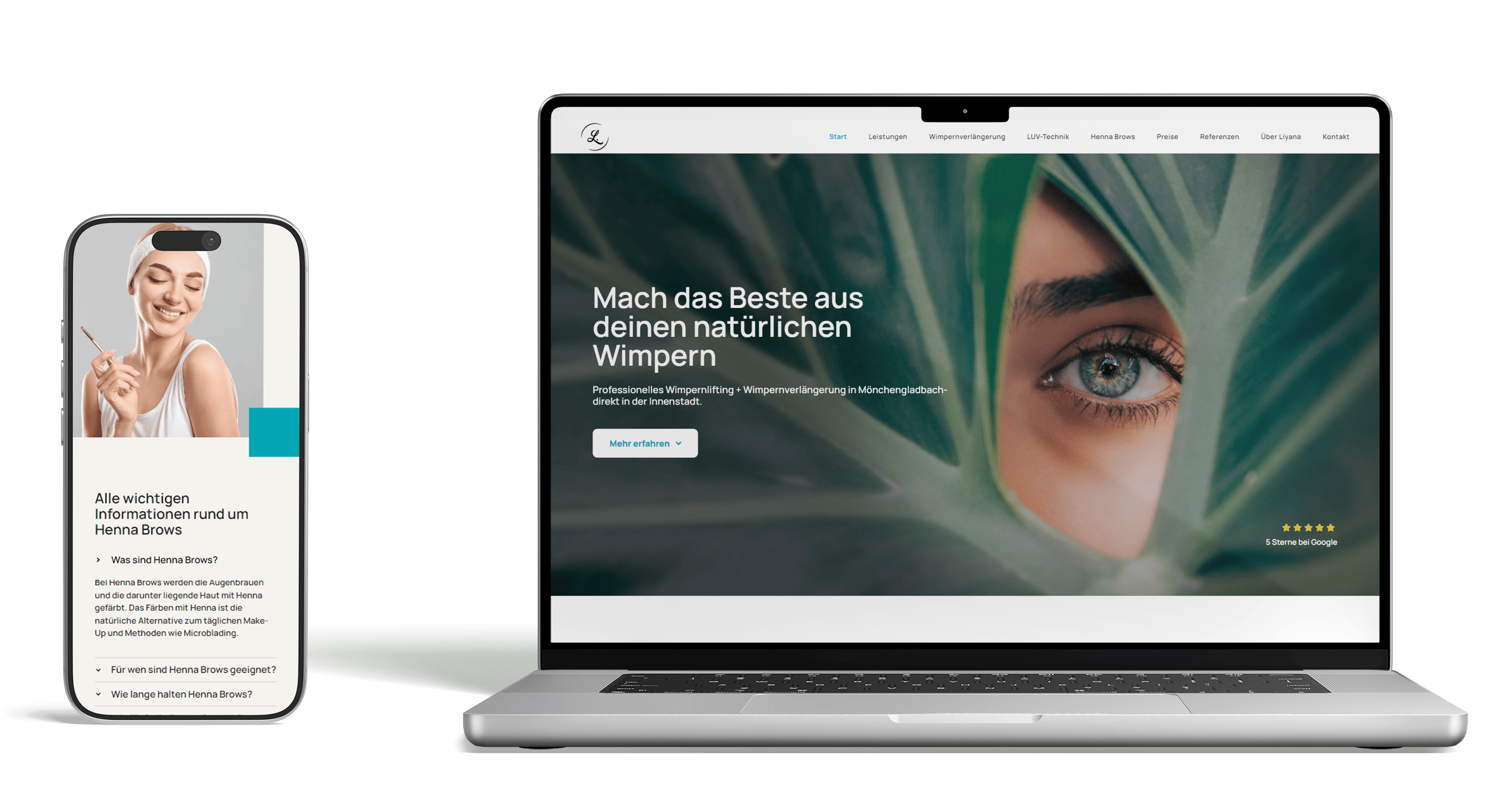
Digital Design
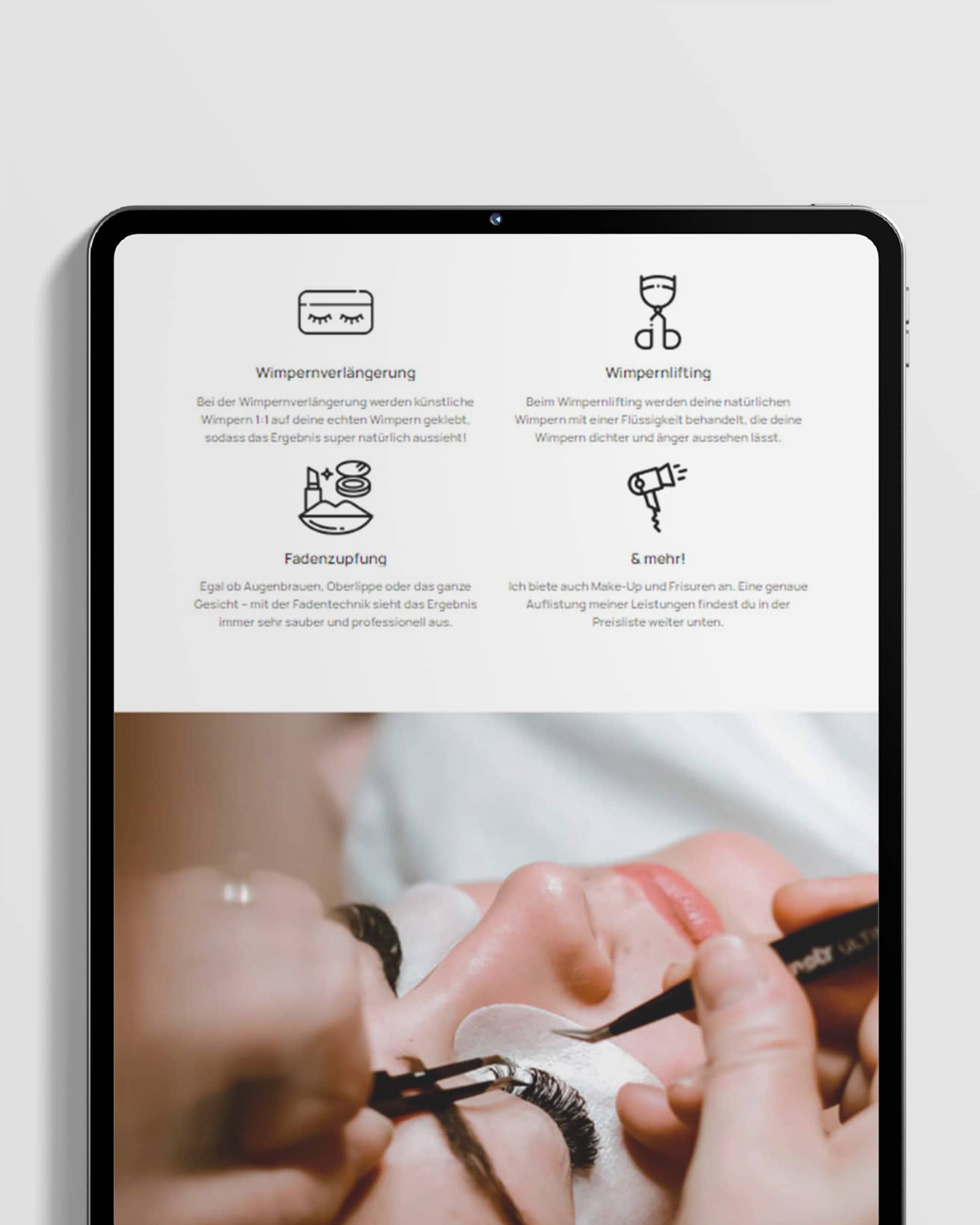
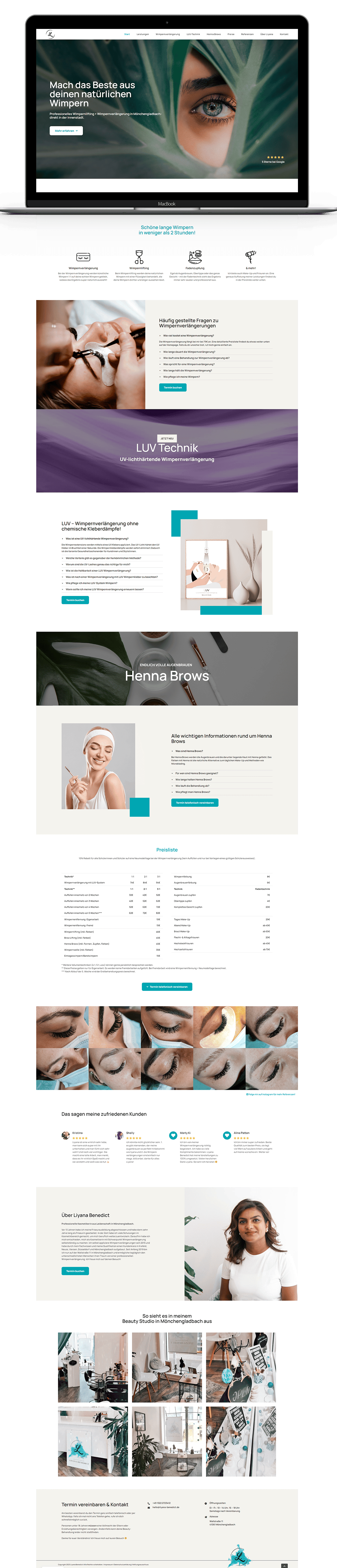
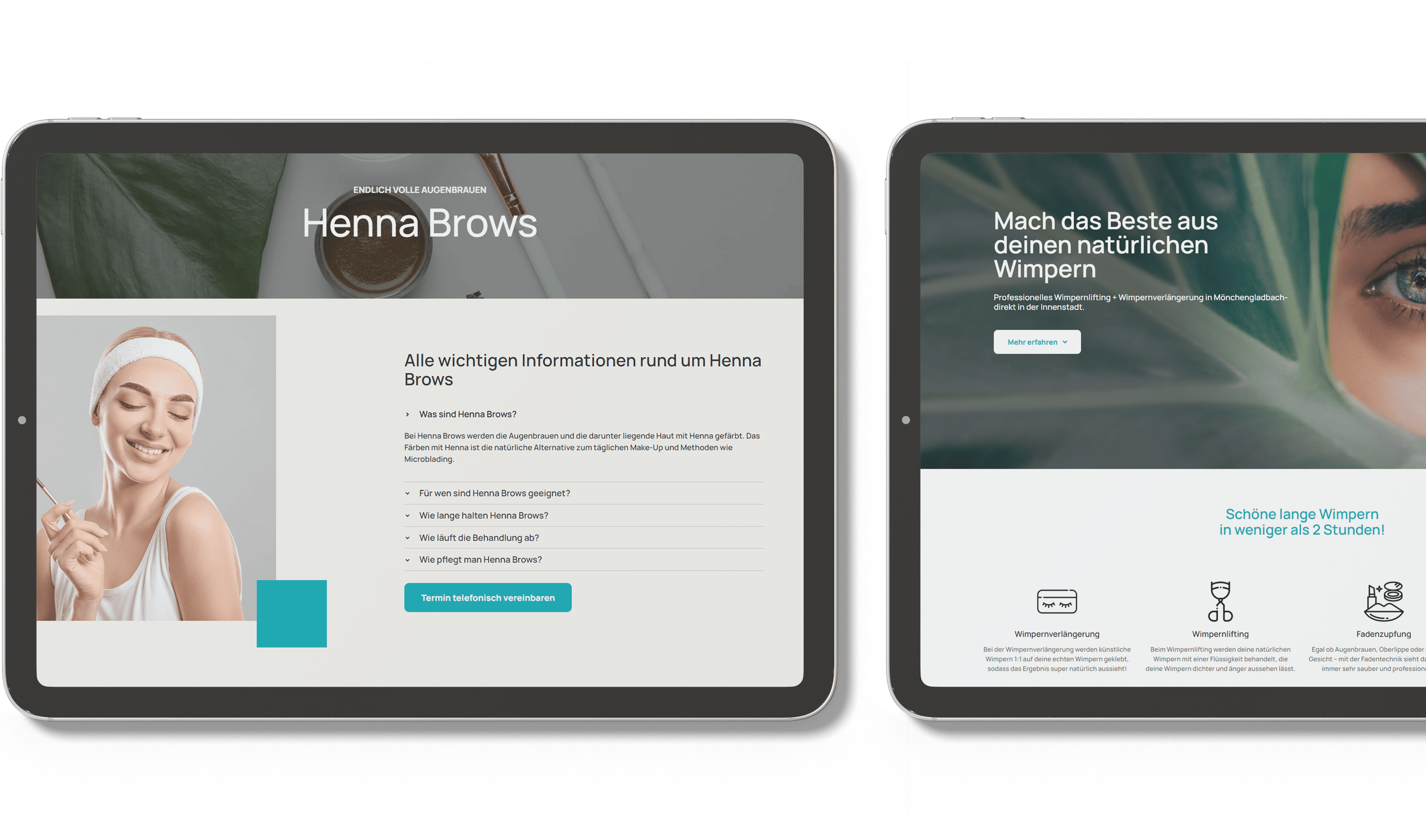
The website was designed as a clear, one-page experience that allows visitors to quickly understand the studio’s services and offerings. Each section focuses on a specific treatment, making navigation intuitive and reducing friction for potential clients. A minimal layout, generous white space, and a strong visual hierarchy ensure the content feels light and approachable while maintaining a high-end aesthetic. The design supports conversion by keeping information concise, easy to scan, and visually consistent with the brand identity. The result is a clean and inviting digital presence that strengthens Liyana Benedict’s brand and supports her studio’s growth.


More Projects
View all Projects
Website for AI-driven Phone Information Service
View Project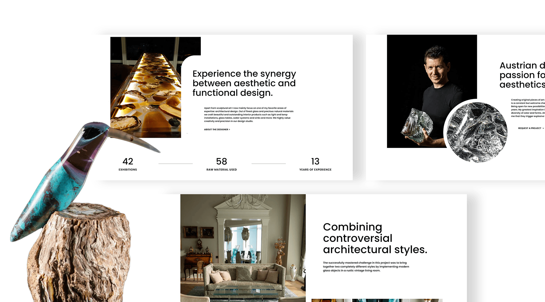
Web Portfolio for an Architectural Artist
View Project